
Ruby
AI-Powered Autonomous Analytics
Platform
Desktop Web App
Project duration
4 Month
Tools
Figjam, Figma
Role
Product Designer (end-to-end, UX research → UI)
✨ About Project
RUBY is an AI-powered analytics product that automatically uncovers business insights from large-scale data without manual exploration or predefined questions.
While the technology focused on automation, the core UX challenge was helping users trust, understand, and act on insights they didn’t explicitly search for.
⚠️ The Problem
As data volume grows, teams had access to more data than ever, yet struggled to understand which insights mattered now.

"We have endless dashboards, but it's hard to know where to focus first."
Operations Manager
Enterprise Company


"Most of my time is spent searching for insights, not acting on them."
Business Analyst
B2B Platform


"I don't know what questions to ask and that's exactly the problem."
VP Finance
Global Organization
🎯 Business goal
Ruby was designed as a growth lever for an existing BI platform-driving adoption, engagement, and retention by adding autonomous insights on top of trusted dashboards. This meant introducing innovation without disrupting existing user trust in the platform
⛰️ The Challenge
Designing Ruby meant balancing autonomy with control introducing AI-driven insights to experienced BI users without overwhelming them or undermining their existing workflows.
KPI of Project

Adoption within existing Necto BI users
25% of existing BI customer organizations enabled Ruby during the initial rollout period.


Engagement with autonomous insights
Average of 10–15 insight interactions per user per session.
️➡️ Project kick-off
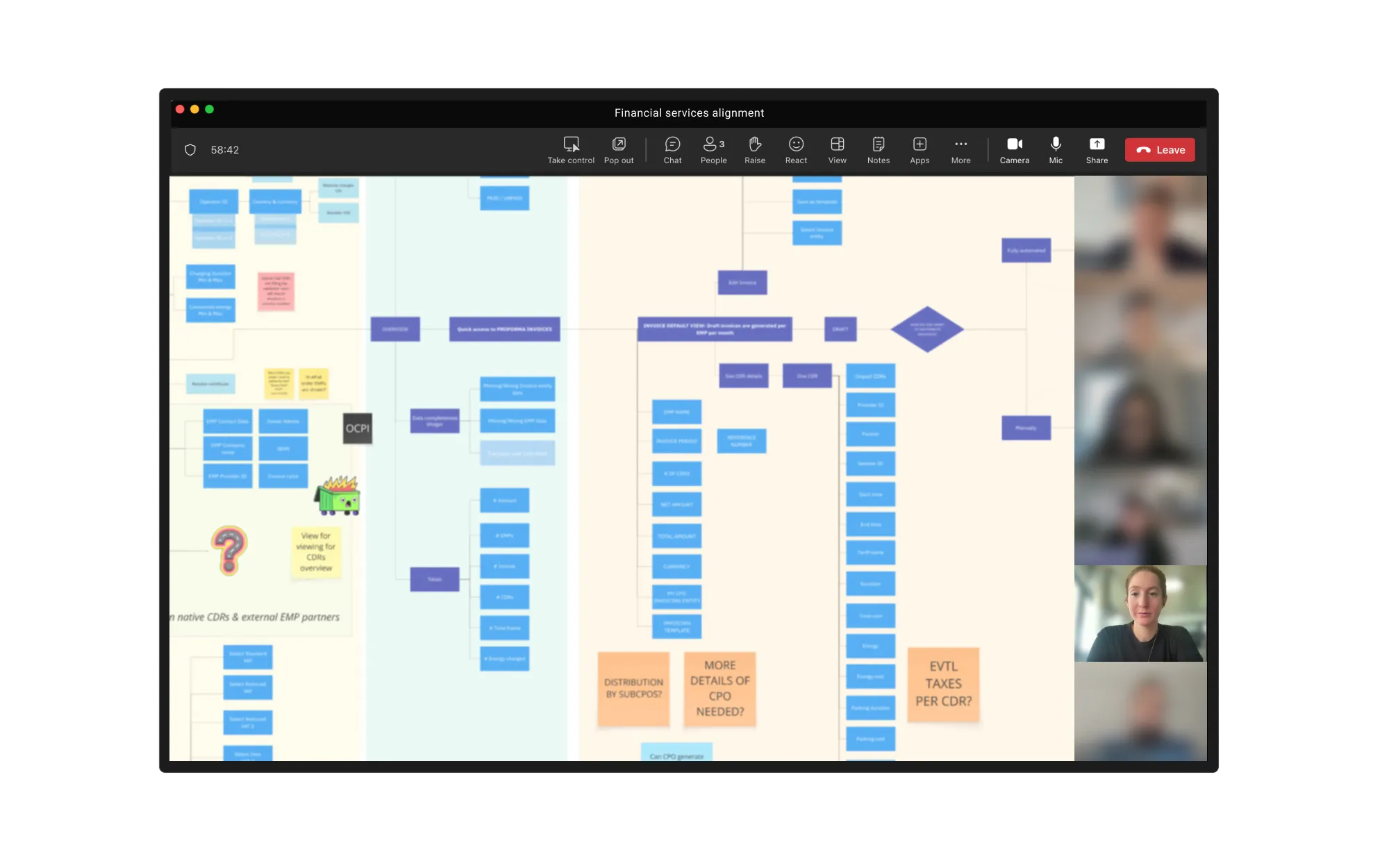
The project started with a joint kick-off session with the Product Manager and Head of Development. Together, we aligned on the project goals, defined the scope, mapped the initial user flow, and discussed timelines, technical constraints.
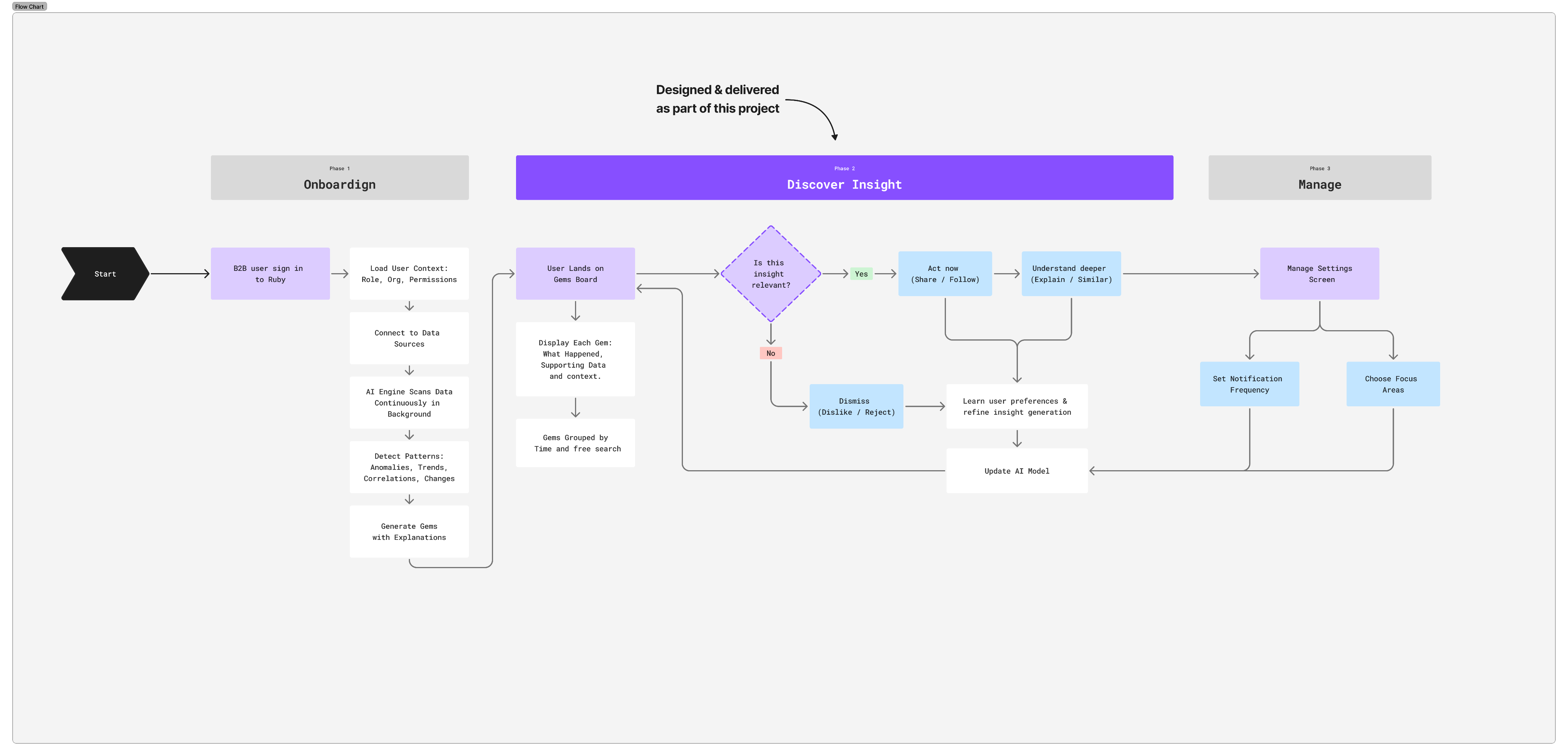
Mapping the end-to-end discovery flow helped identify where users hesitate, question the system, or disengage before acting on insights.
🔎 Discovery and research
I used UX research methods to better understand how the users build dashboards, explore data, and work with insights in their day-to-day workflows. We needed to understand whether the problem was discoverability, interpretation, or decision confidence.
I reviewed existing BI tools to understand common chart patterns and insight types, and interviewed active NECTO users to learn how they explore data and where insights are often missed in their daily workflows.
HMW of my reasarch
How might we help BI users discover insights automatically, while keeping them confident, in control, and focused on what matters most?
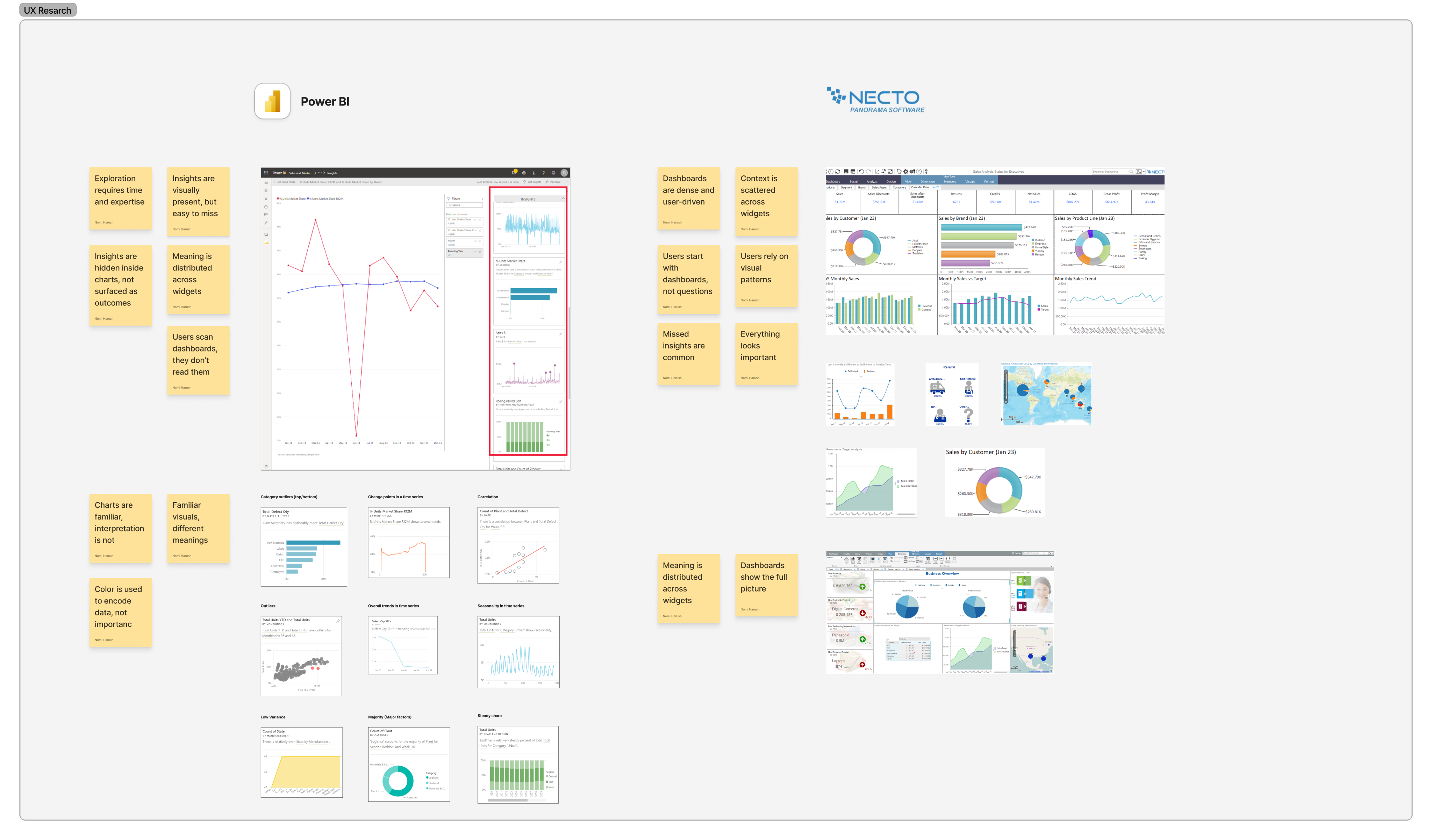
Existing tools assume users know what to look for, leaving a gap when questions are unclear.
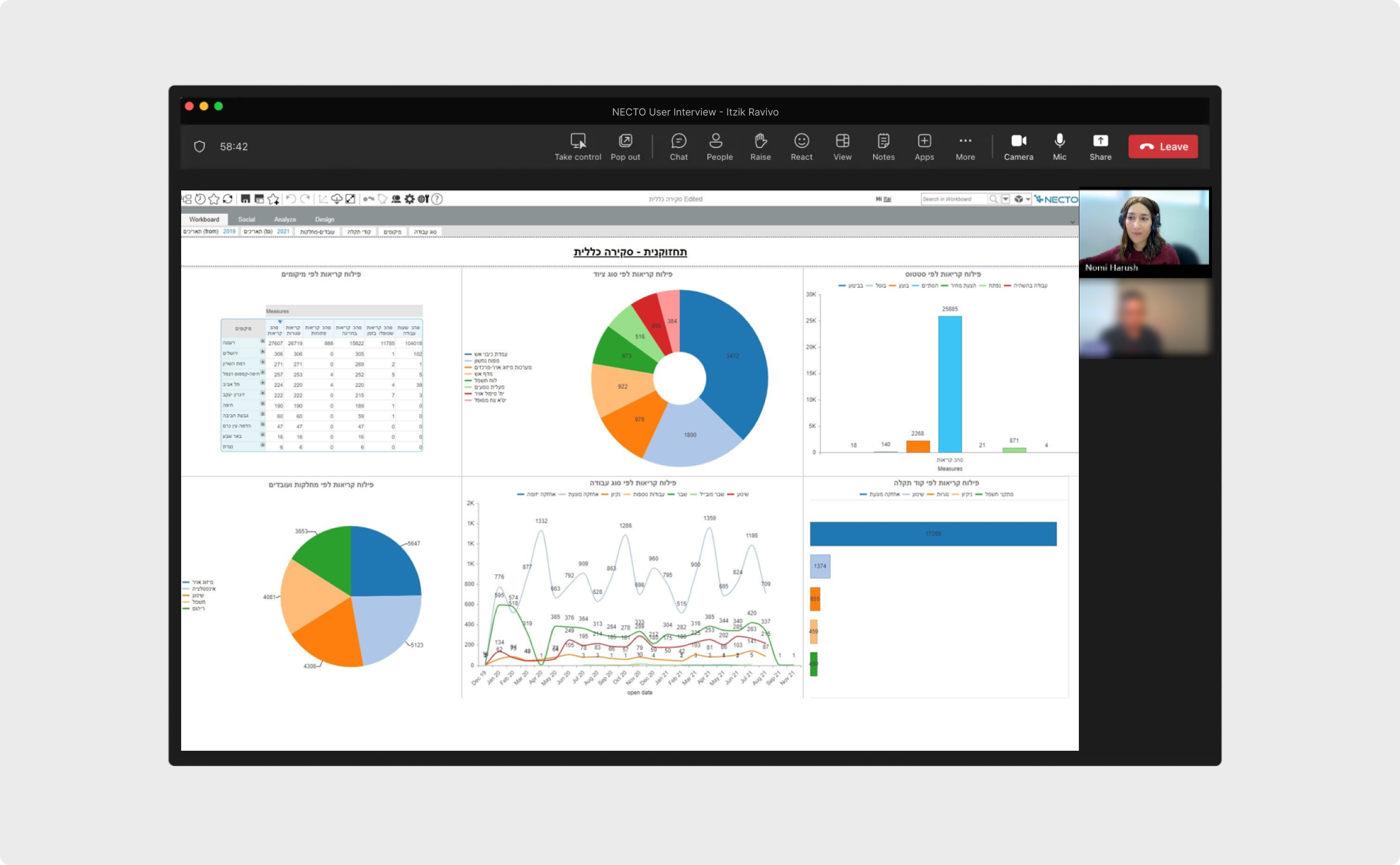
Sessions focused on how users interpret charts, validate insights, and decide whether to act
💡 Key insights from user research
Cognitive overload hides important insights
Most users don’t have time for deep dashboard exploration
Insights without context aren’t trusted
Visual clarity drives understanding and confidence
📝 Validate concept with users
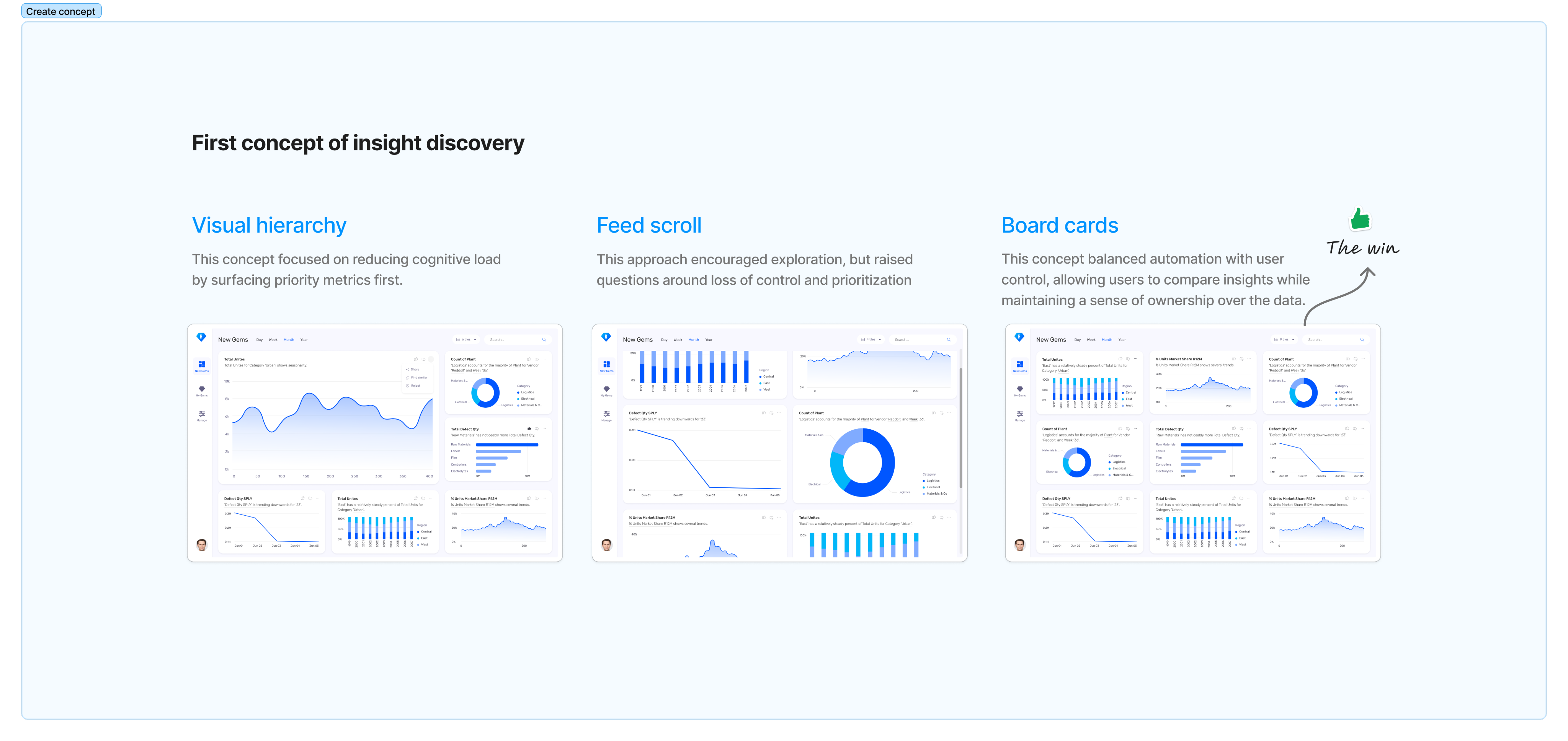
Validation sessions showed that users felt more confident and in control with the board cards concept - even if it required slightly more initial orientation.
🚀 The solution
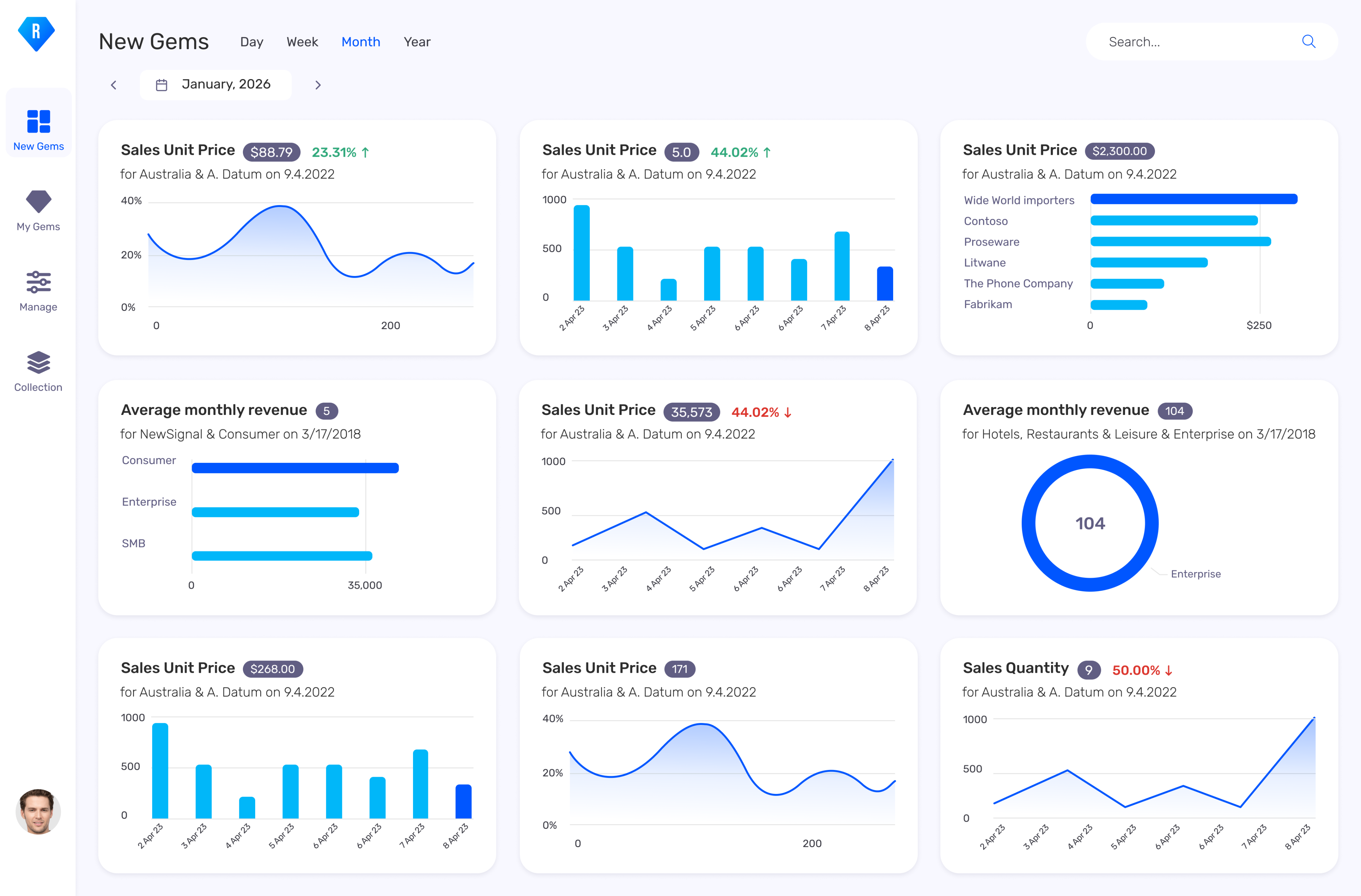
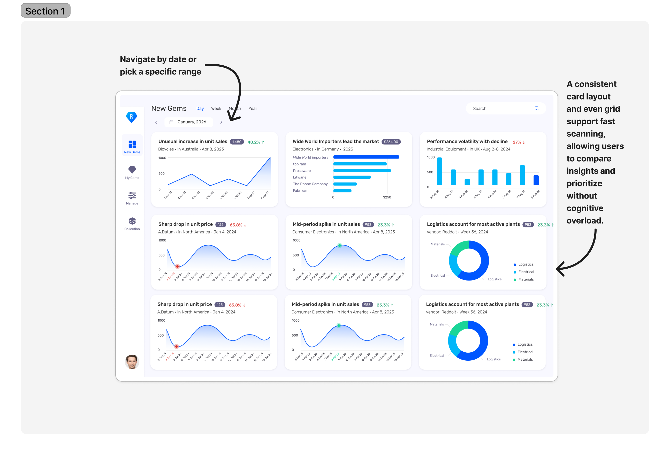
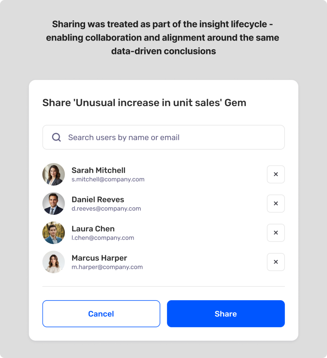
After deciding on the board layout, we focused on defining the content structure of each insight card.
The title highlights what happened, supported by the most salient data, while the subtitle adds essential context such as when and where.
Visual charts substantiate the insight, enabling quick understanding at a glance while still supporting deeper exploration when needed.
The goal was to preserve clarity and trust while balancing immediacy with flexibility.
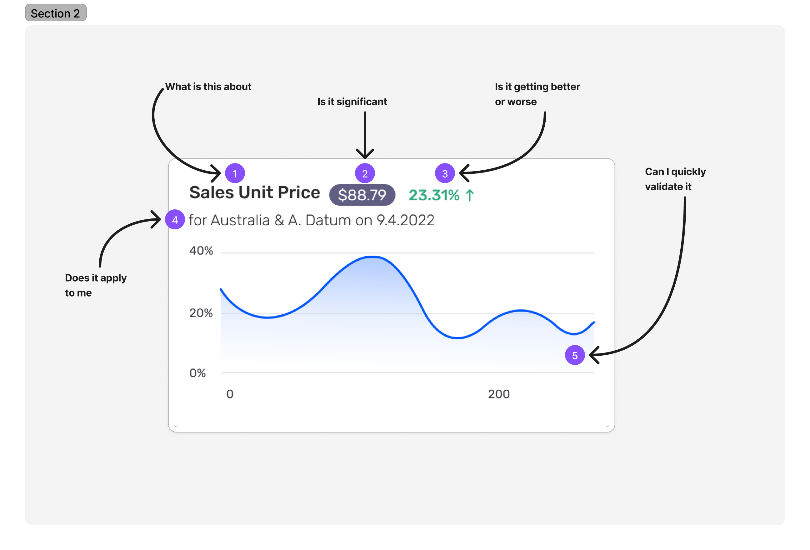
Each insight card was designed to answer a single question: Is this worth my attention right now?
📈 The outcome
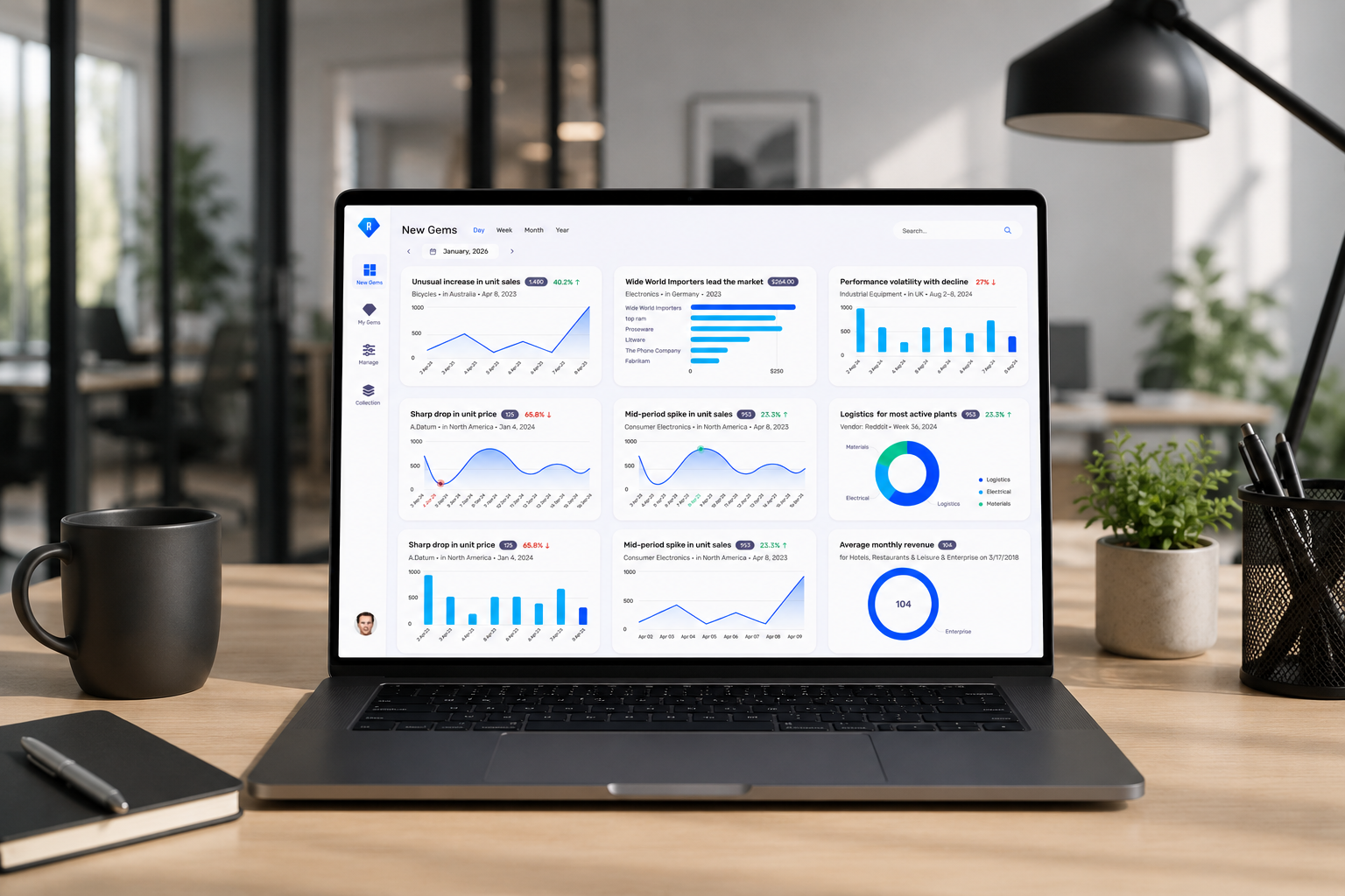
The solution was released in mid-2024 and adopted by existing customer organizations.
Usage patterns and qualitative feedback indicated that users were able to identify relevant insights faster and engage with them more confidently, without disrupting their existing workflows.

"Ruby doesn’t just surface insights - it makes them feel clear, relevant, and easy to act on. The experience builds trust instead of asking for it."
Maya Paz
VP Finance
One of the strongest signals of success came from user feedback, reflecting increased trust in the system’s insights
🌱 Key learning
This project reinforced that in AI-driven products, value isn’t created by surfacing more insights - but by helping users decide which ones deserve attention.
Designing for trust, clarity, and user control proved to be just as critical as the underlying automation itself.

Ruby
AI-Powered Autonomous Analytics
Platform
Desktop Web App
Project duration
4 Month
Tools
Figjam, Figma
Role
Product Designer (end-to-end, UX research → UI)
✨ About Project
RUBY is an AI-powered analytics product that automatically uncovers business insights from large-scale data without manual exploration or predefined questions.
While the technology focused on automation, the core UX challenge was helping users trust, understand, and act on insights they didn’t explicitly search for.
⚠️ The Problem
As data volume grows, teams had access to more data than ever, yet struggled to understand which insights mattered now.

"We have endless dashboards, but it's hard to know where to focus first."
Operations Manager
Enterprise Company
"Most of my time is spent searching for insights, not acting on them."
Business Analyst
B2B Platform
"I don't know what questions to ask and that's exactly the problem."
VP Finance
Global Organization
🎯 Business goal
Ruby was designed as a growth lever for an existing BI platform-driving adoption, engagement, and retention by adding autonomous insights on top of trusted dashboards. This meant introducing innovation without disrupting existing user trust in the platform
⛰️ The Challenge
Designing Ruby meant balancing autonomy with control introducing AI-driven insights to experienced BI users without overwhelming them or undermining their existing workflows.
KPI of Project
Adoption within existing Necto BI users
25% of existing BI customer organizations enabled Ruby during the initial rollout period.
Engagement with autonomous insights
Average of 10–15 insight interactions per user per session.
️➡️ Project kick-off
The project started with a joint kick-off session with the Product Manager and Head of Development. Together, we aligned on the project goals, defined the scope, mapped the initial user flow, and discussed timelines, technical constraints.
Mapping the end-to-end discovery flow helped identify where users hesitate, question the system, or disengage before acting on insights.
🔎 Discovery and research
I used UX research methods to better understand how the users build dashboards, explore data, and work with insights in their day-to-day workflows. We needed to understand whether the problem was discoverability, interpretation, or decision confidence.
I reviewed existing BI tools to understand common chart patterns and insight types, and interviewed active NECTO users to learn how they explore data and where insights are often missed in their daily workflows.
HMW of my reasarch
How might we help BI users discover insights automatically, while keeping them confident, in control, and focused on what matters most?
Existing tools assume users know what to look for, leaving a gap when questions are unclear.

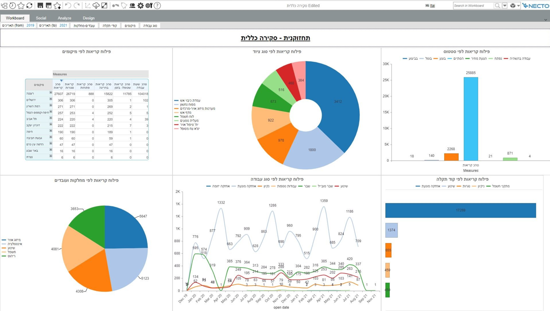

NECTO User Interview - Itzik Ravivo
Sessions focused on how users interpret charts, validate insights, and decide whether to act
💡 Key insights from user research
Cognitive overload hides important insights
Most users don’t have time for deep dashboard exploration
Insights without context aren’t trusted
Visual clarity drives understanding and confidence
📝 Validate concept with users
Validation sessions showed that users felt more confident and in control with the board cards concept - even if it required slightly more initial orientation.
🚀 The solution
After deciding on the board layout, we focused on defining the content structure of each insight card.
The title highlights what happened, supported by the most salient data, while the subtitle adds essential context such as when and where.
Visual charts substantiate the insight, enabling quick understanding at a glance while still supporting deeper exploration when needed.
The goal was to preserve clarity and trust while balancing immediacy with flexibility.
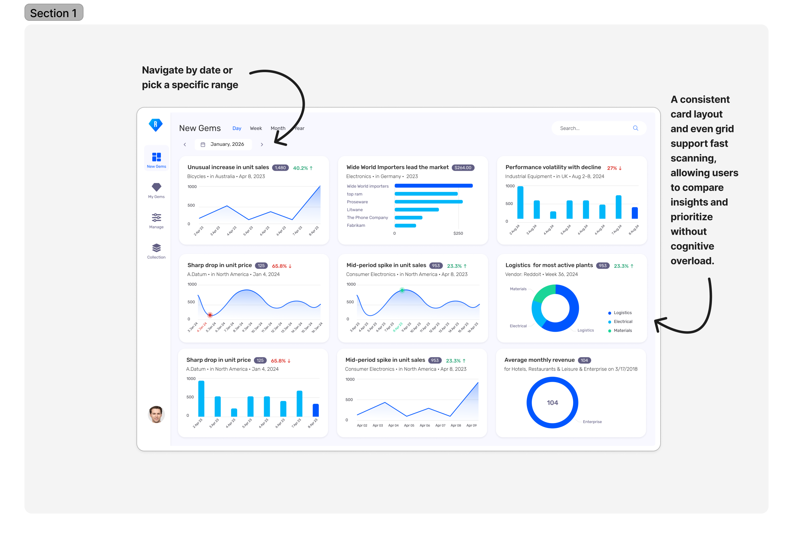
Each insight card was designed to answer a single question: Is this worth my attention right now?
📈 The outcome
The solution was released in mid-2024 and adopted by existing customer organizations.
Usage patterns and qualitative feedback indicated that users were able to identify relevant insights faster and engage with them more confidently, without disrupting their existing workflows.

"Ruby doesn’t just surface insights - it makes them feel clear, relevant, and easy to act on. The experience builds trust instead of asking for it."
Maya Paz
VP Finance
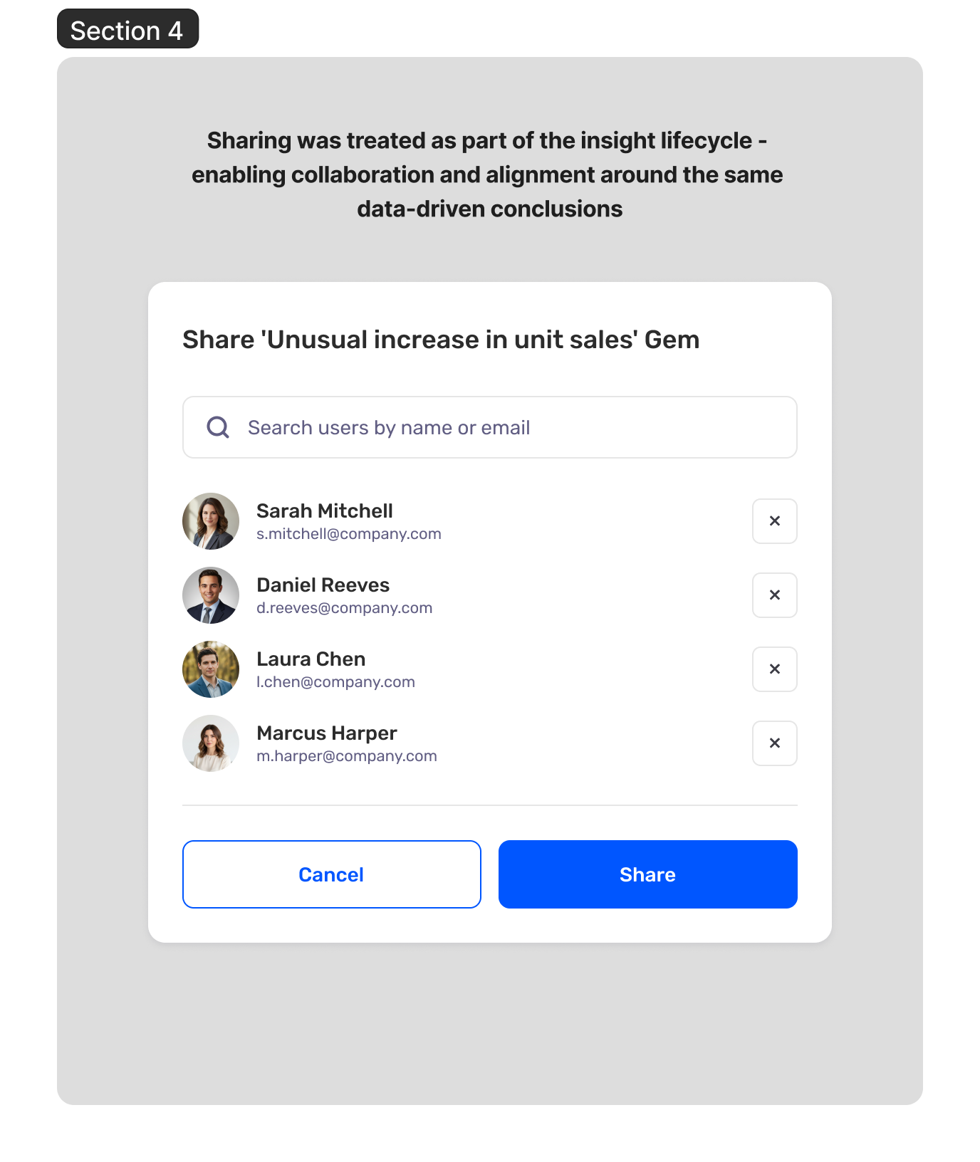
One of the strongest signals of success came from user feedback, reflecting increased trust in the system’s insights
🌱 Key learning
This project reinforced that in AI-driven products, value isn’t created by surfacing more insights - but by helping users decide which ones deserve attention.
Designing for trust, clarity, and user control proved to be just as critical as the underlying automation itself.